This is Hamamoto from TIMEWELL.
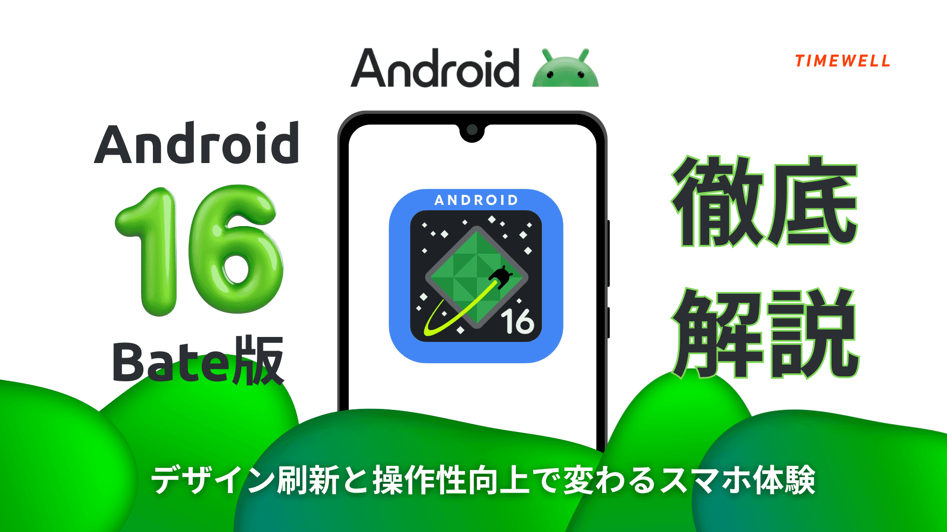
Android 16 Beta: A New Design Era
Recent Android updates have focused not just on adding new capabilities but on refining the moment-to-moment experience of using a phone. Android 16's beta takes this further with Material 3 Expressive—a new design approach that introduces physical sensations into digital interaction.
Where previous Material Design iterations emphasized clean visual hierarchy, Material 3 Expressive adds resistance, elasticity, and depth. Dragging elements feels bouncy. Notifications swing with a rubber-band effect. Quick Settings buttons deform under touch. The goal is to make the interface feel like you're interacting with real objects.
This article covers the key changes in Android 16's beta release across three areas: lock screen and app management, home screen customization, and Quick Settings and system-level interaction.
Looking for AI training and consulting?
Learn about WARP training programs and consulting services in our materials.
Lock Screen and App Management: Expressive Interaction
Redesigned Lock Screen
The lock screen—the first thing users see dozens of times per day—has been substantially reworked. Users can now customize wallpaper, clock display, and notification presentation in detail. Highlights:
- Fade-in animation when browsing wallpapers
- Clock font weight slider for fine-grained typography control
- Flexible notification display modes: switching between icon-only and detailed views depending on need
- Important notifications stay visible in transit and during meetings without requiring full unlock
Recent Apps: Split-Screen Access
The Recent Apps screen adds a dropdown menu for each app, enabling users to launch split-screen mode directly without navigating through additional menus. This makes multitasking more accessible on both phones and tablets—particularly useful in business contexts where switching between reference materials and active work is common.
The windows themselves respond to adjacent elements: dragging one window creates a visible reaction in neighboring windows, with subtle haptic feedback confirming each interaction.
The Material 3 Expressive Philosophy
The visual changes reflect a clear design lineage—from original Material Design to Material You to Material 3 Expressive—but the underlying philosophy has shifted: the interface should respond like a physical object, not just animate smoothly. User customization is elevated from nice-to-have to core design value.
Home Screen: Weather Effects and Cinematic Motion
More Compact Widgets
The "At a Glance" widget—previously large and prominent—has been made smaller and more refined, freeing up screen space for app icons. The trade-off between information density and visual clarity has been rebalanced in favor of the latter.
Wallpaper Effects
A new effects button in wallpaper settings enables:
- Depth effect: Creates a layered, window-like appearance as if looking through a frame
- Color extraction: Automatically extracts the dominant color from your wallpaper and applies a matched overlay
- Weather effects: Real-time atmosphere simulation with four modes—fog, rain, snow, and sunlight—adjustable to match mood or conditions
Cinematic Motion
The headline new feature. On first activation, the system downloads a cinematic model from the internet. Once installed, it analyzes a still photo and applies 3D motion—making people, pets, and objects appear to float or move within the frame.
The effect turns the home screen from a static launcher into something closer to a living display. Practical applications include presentation devices, retail displays, and any context where the phone's screen is visible to others as well as the user.
All effects include slider controls for intensity, making them easy to tone down for professional contexts.
Quick Settings: Intuitive, Tactile Controls
The New Visual Language
Quick Settings now uses a glass-like transparent background, creating a cleaner, calmer visual tone. This isn't purely aesthetic—the reduced visual weight makes it easier to locate specific controls quickly.
The brightness slider has been redesigned for fine control. Rather than a simple drag target, it responds with subtle deformation as you touch and adjust it—reinforcing the sense of physical engagement that characterizes Material 3 Expressive throughout.
Full Customization
Quick Settings tiles are now fully rearrangeable in size and position. Frequently used controls (flashlight, Bluetooth) can be made larger for easier access; infrequently used controls can be condensed. This reduces accidental taps and speeds up access to high-priority functions.
Bluetooth tile behavior: Tapping the main tile area opens the full Bluetooth menu; a smaller adjacent icon handles on/off toggling. Two distinct interaction patterns within the same control—serving different user needs without requiring an extra tap.
Notification Interactions
Individual notifications now use a rubber-band effect when swiped—rather than sliding out flatly, they spring with elastic resistance. This tactile signal helps distinguish deliberate dismissal from accidental swipe, reducing the risk of losing important information during busy moments.
Settings App Refresh
The Settings app itself has been reorganized: better spacing between items, optimized touch targets, and a unified design language for sliders (volume and brightness now share the same visual style throughout the system). The app list screen has shifted to semi-transparent backgrounds, creating visual continuity with the home screen and emphasizing the phone as a unified system rather than a collection of separate parts.
Summary
Android 16's beta delivers a coherent design vision: interfaces that feel like physical objects, with elastic resistance, haptic confirmation, and depth effects that make ordinary interactions more engaging.
The practical improvements—lock screen flexibility, split-screen from recent apps, Quick Settings customization, notification elasticity—are genuinely useful for daily and business use. The more expressive features—Cinematic Motion wallpaper, weather effects, deforming buttons—may appeal more in consumer contexts or where the device serves as a display.
The Material 3 Expressive direction suggests Android is willing to compete not just on features and specs, but on the qualitative feel of using a phone day-to-day. That's a meaningful shift in emphasis, and one worth watching as the final release approaches.
Reference: https://www.youtube.com/watch?v=j7W2v_FmCuE