Value Proposition Canvas Worksheet (editable PPT)
A Value Proposition Canvas that fits the customer profile to your value map to articulate the value you offer.
Download the PPT (free)PowerPoint (.pptx) ・ no email required
Hello, this is Ryuta Hamamoto from TIMEWELL.
Have you ever pitched a new business idea to someone, only to be asked, "So, in the end, whose problem does this actually solve, and why do they care?"—and found yourself lost for words? You believe there's value in it, yet the moment you try to say it out loud, all that comes out is something vague like "it makes things more convenient" or "it improves efficiency." The tool for untangling that "I can't quite put the value into words" feeling, on a single sheet of paper, is the Value Proposition Canvas (VPC for short).
This article is STEP 3 in a nine-step series on building a new business. If the previous step had you dig into your customers' problems with an empathy map, then now it's time to put into words what you're going to offer in response to those problems. The full picture is laid out in the Complete Guide to New Business Frameworks, so if you want to work through it in order, start there.
The goal of this article is for you to be able to fill in an entire canvas by the time you finish reading. I'll keep the abstract theory to a minimum and write at a level detailed enough to act on—where to start, what to write and how, and how to get AI to help. So that you can move forward as you read, I've made a free sample PowerPoint template available to download. You'll understand it faster if you open it up in front of you before reading on.
By the way, if you want to bounce your business concept off AI and polish it, it helps to first take a quick measure of your current level of AI usage with the AI Literacy Check. That way you'll get more out of the prompt collection in the second half of this article.
What is a Value Proposition Canvas?
The Value Proposition Canvas is a framework that Alexander Osterwalder and colleagues—known for Business Model Generation—systematized in its sequel, Value Proposition Design (2014)1. In a nutshell, it's a thinking template for making "what the customer truly wants to get done" and "the value your company offers" mesh together without any gaps.
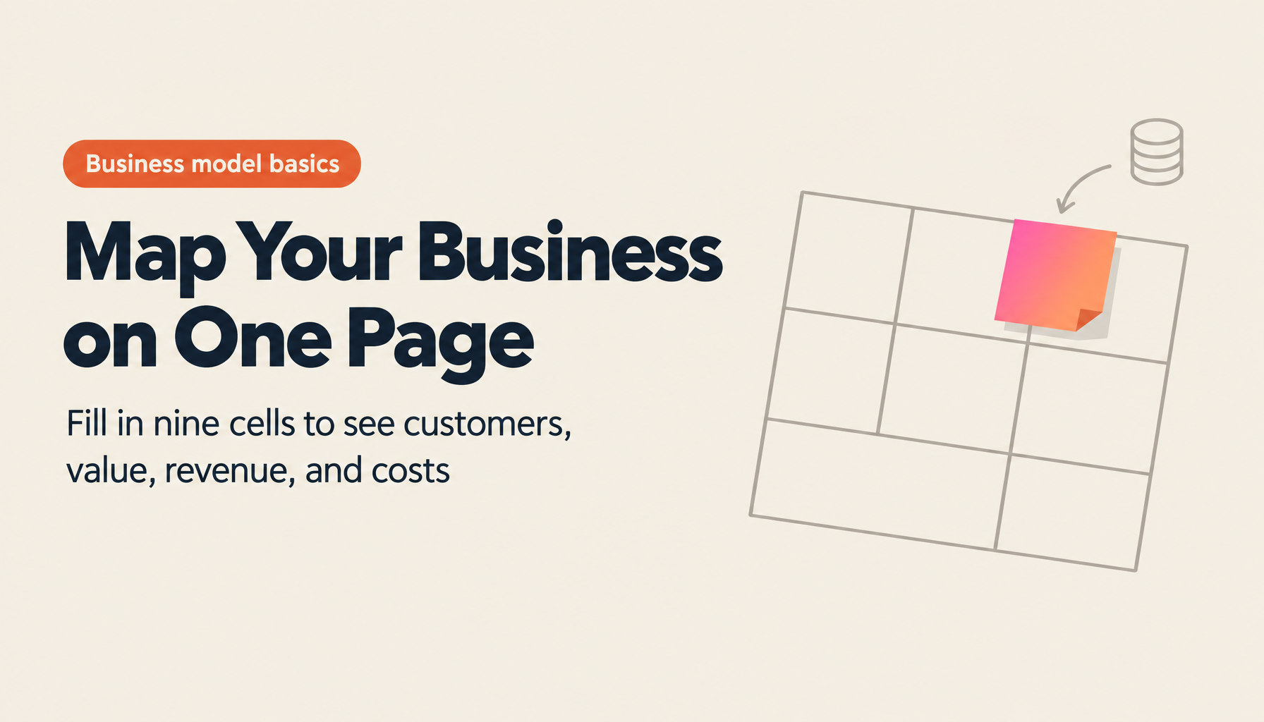
One thing worth keeping in mind here is that the VPC is not a tool that stands on its own. The VPC is, so to speak, a magnifying glass for taking just two of the nine blocks of the Business Model Canvas (BMC)—which gives you a bird's-eye view of the whole business—the "customer segment" and the "value proposition," and enlarging them. If the BMC is the overall map of your business, the VPC is the detailed drawing that digs into the spot on that map where the most is at stake. That's why you're really meant to use them as a set. Remember the relationship this way: sketch the whole with the BMC, and dig into the value proposition—the heart of it—with the VPC.
Let me also untangle, up front, a source of confusion you're bound to run into when you search in Japanese. When you search for "value proposition," you often see a Venn diagram overlapping three circles: "our strengths," "customer needs," and "the value competitors offer." The explanation goes that the value you offer is precisely the center where the three circles overlap. That's a perfectly clear diagram in its own right, but it's a different thing from Osterwalder's VPC. As I'll explain later, the VPC is made up of two sides and six blocks, and it doesn't include competitors as a direct component (you consider differentiation from competitors at the final stage, when you distill the value into a single sentence). Since their goals are close, there's no harm in using them together, but the structures are completely different, so read carefully and be conscious of "which one is being referred to." What this article covers is the latter—Osterwalder's version.
Behind the VPC lies the idea of "Jobs to be Done," popularized by the late Clayton Christensen. As the famous analogy goes—people don't want a drill, they want a "hole"—customers aren't after the product itself; they "hire" a product to get done some task (a job) they want to accomplish in their life or work. The right half of the VPC takes this "customer's job" as its starting point.
Looking for AI training and consulting?
Learn about WARP training programs and consulting services in our materials.
Understanding the two sides and six blocks
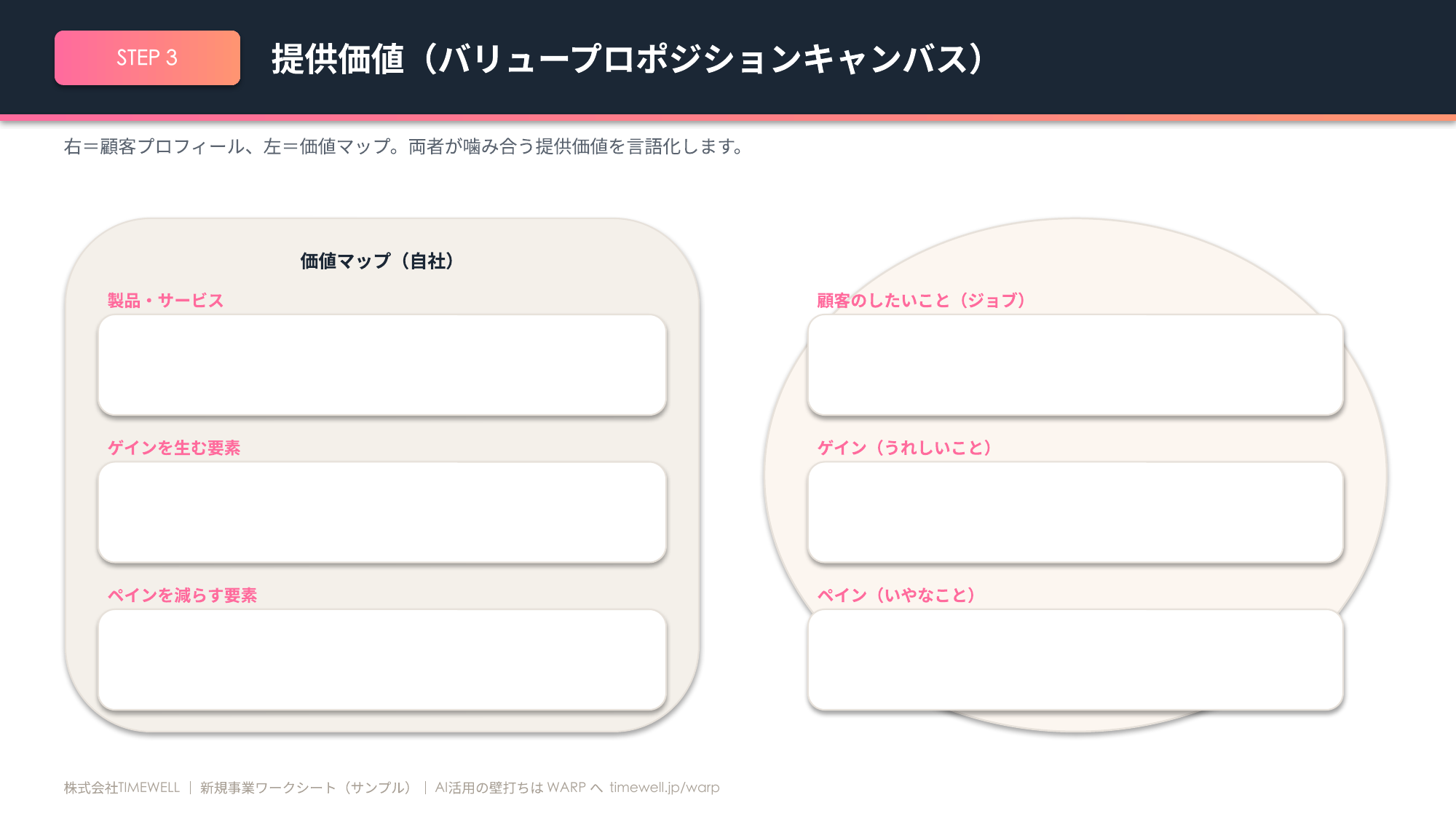
The canvas is made up of two sides: a circle on the right and a square on the left. The circle on the right is the customer profile, and the square on the left is the value map. In the official layout, the square value map sits on the left and the circle customer profile on the right. This is to line up with the BMC's arrangement, and it's easier to remember if you position your company (the provider) on the left and the customer on the right.
The customer profile (the circle) on the right further breaks down into three blocks. The first is "customer jobs"—the tasks the customer wants to get done or the things they want to achieve. The second is "pains"—the frustrations, obstacles, and risks that get in the way of getting that job done. The third is "gains"—the outcomes and delights the customer wants to obtain. The important thing when filling in this circle is not to grasp jobs purely in functional terms. Beyond functional jobs—getting a specific task done—there are social jobs, about how one wants to be seen by others, and emotional jobs, about wanting to feel reassured or confident. Surprisingly often, the hints for differentiation lie dormant in these social and emotional jobs.
For pains, you'll miss fewer of them if you tease them out from three angles: unwanted outcomes, obstacles that keep the customer from even starting, and bad things that could happen (risks and anxieties). Emotional words like "it's a hassle," "it's awkward," and "I'm likely to get it wrong" are perfectly valid pains too. For gains, capture them across four levels: required gains (without which the whole thing is a non-starter), expected gains (ones they take for granted), desired gains (ones they'd be glad to have but wouldn't ask for themselves), and unexpected gains (surprises that exceed expectations). Rather than writing everything out flat here, the key is to rank pains by severity and gains by importance. That's because what you're aiming to make is not a "vitamin" that's merely nice to have, but a "painkiller" that eliminates a strong pain.
The value map (the square) on the left is also three blocks. Under "products and services" you list the offerings themselves; under "pain relievers" you write how the product removes pains; and under "gain creators" you write how the product produces gains. And the state in which both sides mesh together properly is called "Fit." Fit comes in stages: first "problem–solution fit," where the customer's problem and the solution mesh on paper; next "product–market fit," where the value has been proven in an actual market; and finally "business model fit," where it has been built into a profitable business. What the VPC directly covers is mainly the first stage. Whether or not you can carefully draw this out on paper greatly affects how efficient your later validation will be.
The core of writing it is "write the circle first"
The single most important thing in how you write the VPC is the order. Always write the customer profile (the circle) on the right first, and write the value map (the square) on the left afterward. The reason is simple: if you write your own solution first, you end up reverse-engineering jobs and pains to fit that solution conveniently, and the circle gets warped to suit your own agenda. This is the most common failure in building a new business, and I myself have stepped in this trap many times in the past. Just keeping to the order prevents this accident to a considerable degree.
Let me walk through the concrete procedure.
First, as Step 0, narrow the target customer segment down to one. If you mix multiple customers onto a single canvas, both the jobs and the pains get averaged out and blurred, and it ends up resonating with no one. Be specific enough that a face comes to mind—something like "someone in their thirties, in a dual-income household with preschool-age children." If you have multiple targets, split the canvas by the number of them, however tedious that is. This connects naturally if you bring in one of the segments you carved out in customer segmentation.
In Step 1, write the customer's jobs. Set aside your own product for the moment, picture the flow of that person's day or work, and write them out split into the three kinds: functional, social, and emotional. In Step 2, list pains as the frustrations and obstacles that arise before, during, and after the job. In Step 3, write gains across the four levels: required, expected, desired, and unexpected. Don't just pick up the flip side of pains (frustrations disappearing)—be sure to capture the value they actively want, too. In Step 4, rank the jobs, pains, and gains you've written so far by severity or importance, and narrow each down to roughly the top three. Not trying to respond to everything is the first step toward making a painkiller.
Building this circle by grinding through it alone is hard going, so it gets a lot easier if you have AI mass-produce drafts. Try rewriting the following prompt for your own segment and pasting it in.
You are a customer researcher for a new business venture. You are well versed in Jobs to be Done and Osterwalder's Value Proposition Canvas, and you excel at describing customer problems in the customer's own words. For the customer segment below, create the right-hand side of a Value Proposition Canvas—the "customer profile (the circle)."

# Customer segment: [e.g., Freelancers 1–3 years into going independent. Bad at bookkeeping]
# Information you have, or interview notes: [Paste if any. If none, write "hypotheses are fine"]

How to think it through:
(1) First, imagine this segment's day or workflow chronologically in 3–5 scenes from morning to night, and write down what they are doing in each scene (do not think about your own product at all)
(2) From that flow, extract the customer's jobs, split into three kinds: functional, social, and emotional
(3) List the pains that arise before, during, and after getting each job done
(4) List the gains the customer wants to obtain, across four levels: required, expected, desired, unexpected

Output format (follow this structure strictly):
■ Customer jobs — three each under "functional / social / emotional," as bullet points
■ Pains — a table with these columns: | Pain | Angle (unwanted outcome / obstacle / risk) | Severity (high / medium / low) | Basis for this judgment |. Five rows
■ Gains — a table with these columns: | Gain | Level (required / expected / desired / unexpected) | Importance (high / medium / low) |. One or two rows per level
■ Fact/hypothesis labels — for every item above, state whether it is a "verified fact" or an "unverified hypothesis," and mark hypotheses with a ★

Constraints:
・Do not use abstract words like "convenient" or "efficient"; go all the way down to the specific task, situation, and emotion (e.g., not "confirming payments is a hassle" but "every time a payment arrives, they open the banking app and visually reconcile the amount")
・If you use a number, when you have no firm evidence, mark it "assumed" and add a one-line note on the premise
・Do not write an item you have no information on as if it were fact; if it's imagination, always mark it with a ★
・Finally, list the "top three weakest hypotheses that most need validating," adding a one-line note on why each is shaky
The items marked with a ★ here are the parts that are still just your imagination. Every block of the VPC is nothing more than a hypothesis. As Step 5, interview 5–10 prospective customers and distinguish whether the items you wrote are "hypotheses (your own imagination)" or "facts (things the customer actually said)." If something is off, don't hesitate to rewrite the circle. Asking neutrally is surprisingly hard, so the accuracy improves if you have AI help you craft the questions, too.
You are an expert in customer interview design, skilled at drawing out facts without leading the witness. Convert the "unverified hypotheses" marked with ★ in the Value Proposition Canvas below into a list of questions for confirming them through customer interviews.

# Unverified hypotheses (jobs / pains / gains): [Paste]
# Intended interviewee: [e.g., Freelancers 1–3 years into going independent. If none, write "the segment can be assumed"]

Design rules:
(1) Ask in a neutral way that never hints at your own solution or idea
(2) Draw out concrete past behavior and episodes rather than opinions or predictions (not "do you think that…" but "the last time you did that, what did you actually do?")
(3) For each pain, always probe its severity and what workaround (doing it by hand, another company's service, just putting up with it, etc.) they are getting by with now

Output format (fixed as a table): build a table with these columns | Priority | Question | Hypothesis it tests | Leading phrasing to avoid here |
・Ten open-ended questions, ordered from highest priority
・Set priority by "how badly the business collapses if that hypothesis proves wrong"

Constraints:
・Do not write hypothetical or future-tense questions like "what do you think?" or "would you use it if it existed?" (ask about past behavior)
・Avoid jargon and insider terms; use plain words the interviewee can answer directly
・Finally, self-flag three points where this list is "easy to under-ask, or where bias is likely to remain"
The trick is to always ask "how are you getting by right now?" in the interview. Once existing workarounds (doing it by hand, another company's service, a spreadsheet, just putting up with it, and so on) come into view, you can see who you're really up against.
Write the value map and inspect the fit
Only once the circle is firm do you move to the value map on the left. In Step 6, first list, under "products and services," the features or menu of what you provide. In Step 7, write the "pain relievers." This is the crux: for each of the top pains you narrowed down in Step 4, match it one-to-one with "which feature removes that pain, and how." Rather than just lining up feature names, picture drawing a line that connects "this pain is eliminated by this feature, like so." In Step 8, write the "gain creators" for the top gains in the same manner.
Be careful not to confuse the product's features (advantages) with the value the customer obtains (benefits). "It has a bank-account linking feature" is merely an advantage. Only when you write it all the way to "the chore of checking your passbook every time to confirm a payment disappears" does it become a pain reliever. Being satisfied with merely lining up feature names on the value map is a very common failure.
And then Step 9, inspecting the fit. Check whether, for each important job, severe pain, and required gain, there exists a corresponding pain reliever or gain creator. If a top item has no corresponding solution, that's a "value gap"—the highest-priority spot to fill. Conversely, if you've gone out of your way to prepare a feature for a pain no one is troubled by, that's an "overreach feature," and a candidate to cut in the early stage. This gap-checking, too, is efficient if you have AI surface it objectively.
You are a product manager, skilled at meshing customer problems (pains and gains) with your own features one-to-one, and at distinguishing advantages (features) from benefits (the value the customer obtains). Based on the customer profile and our offerings below, create the left-hand side of a Value Proposition Canvas—the "value map (the square)."

# The customer's top pains (three): [Paste]
# The customer's top gains (three): [Paste]
# Our products, services, and features: [Paste as a bulleted list]

How to think it through:
(1) List the offerings as "products and services"
(2) For each top pain, match one-to-one which feature eliminates that pain and how
(3) For each top gain, match one-to-one which feature produces that gain and how
(4) Surface the gaps and excesses in these correspondences

Output format (follow this structure strictly):
■ Products and services — bullet points
■ Pain relievers — a table with these columns: | Top pain | Corresponding feature | How it eliminates it (a one-sentence benefit) |
■ Gain creators — a table with these columns: | Top gain | Corresponding feature | How it produces it (a one-sentence benefit) |
■ Value gaps and overreach features — bullet-list separately the "pains/gains with no corresponding feature (value gaps)" and the "features not tied to any top item (candidate overreach features)"

Constraints:
・Don't stop at a feature name (an advantage) like "it has a bank-account linking feature"; write all the way to the change the customer gains (the benefit), like "the chore of checking your passbook every time to confirm a payment disappears"
・Abstract words like "convenient" or "efficient" are banned; go down to the specific task, time, and situation
・Do not fabricate features; if you add one not in the offerings list, mark it "new proposal"
・Finally, self-flag three places in this value map where "the fit is weak, or you may have filled it in on assumption"
When you want the whole fit evaluated strictly, it works well to have AI do a harsh review from an investor's point of view. It draws out quite a few of the self-serving assumptions you can't notice on your own.
You are a harsh mentor with an investor's perspective. Having passed on countless ventures, you sharply separate painkillers from vitamins and mercilessly poke at self-serving assumptions. Critique the entire Value Proposition Canvas below.

# Customer profile (jobs / pains / gains): [Paste]
# Value map (products / pain relievers / gain creators): [Paste]
# Business premises (target market, how it charges, etc., as far as known): [Paste if any]

Perspectives for evaluation:
(1) Does the value proposition fit the important jobs, severe pains, and required gains?
(2) Is this a "painkiller (eliminates a strong pain)" or a "vitamin (merely nice to have)"?
(3) Which items are self-serving rather than customer-serving?
(4) The top three most dangerous hypotheses that most need validating (ordered by how badly the business collapses if wrong)

Output format (follow this structure strictly):
■ Overall verdict — one of "painkiller / hard to say / vitamin," with the reason in three sentences or fewer
■ Critique by perspective — split (1)–(4) above into headings, and under each write "problem" then "suggested improvement"
■ Top three dangerous hypotheses — a table with these columns: | Hypothesis | Why it's shaky | How to validate it (the smallest experiment) |

Constraints:
・Don't stop at "good" or "weak"; point out specifically which item, which part, and why you can say so
・Don't end on praise; include at least three tough critiques
・Do not fabricate facts; where you lack information to judge, explicitly note "information on X is missing" and give a provisional assessment
Articulate your value in a single sentence (a worked fictional example)
Once the canvas is filled in, the last thing to do is to articulate your value in a single sentence. If you've come this far and can't put it into words, I take that as a sign that the value isn't yet settled. The template is simple—plug it into: "We help
Since it's hard to picture while it stays abstract, let me run one fictional new business all the way through as an example. The business is called "Shime-Kuru." The premise: an app for freelancers 1–3 years into going independent (designers, writers, engineers, and the like) that automates everything from creating invoices to confirming payments and exporting data for tax filing, all on a smartphone. It targets the segment that tried existing accounting software but gave up because it was too feature-heavy to master.
Writing out the customer profile (the circle) looks like this. Functional jobs: "create and send invoices," "confirm whether payment has arrived," "chase unpaid invoices," and "get data in order for tax filing." A social job: "want to be seen by clients as a proper, established business." An emotional job: "want the reassurance of managing my own finances." Pains: creating invoices is a hassle so it gets put off (severity: high); checking a passbook or app every time to confirm payment is a chore (medium); chasing unpaid invoices is awkward and hard to bring up (high); getting a whole year in order before filing is hell (high); accounting software is too feature-heavy and expensive, and they gave up on it (medium). Gains: required is an invoice with the correct invoice registration number and consumption tax; expected is that it completes on a smartphone alone and looks clean; desired is automatic detection of payments and automatic reminders for unpaid ones; unexpected is one-click export of tax-filing data or a cash-flow graph—and so on.
Against this, you match up the value map (the square). Products and services: invoice-compliant invoice templates, bank-account linking, automatic reminder emails, one-click export of tax-filing data, and the smartphone app. Pain relievers: an invoice is complete just by picking a template, eliminating "putting it off"; account linking automatically reconciles payments, eliminating "the chore of checking the passbook"; automatic reminders with set phrasing take over "the awkwardness of chasing"; and automatic annual aggregation of data eliminates "the pre-filing hell of getting things in order." Gain creators: automatic calculation of the invoice registration number and consumption tax (a required gain), professional-looking design templates (the expected gain of "a trustworthy appearance"), automatic payment detection and reminders (a desired gain), and a cash-flow graph (an unexpected gain).
Distilled into a single sentence, it becomes this: "Fledgling freelancers who are bad at bookkeeping can get their invoicing and payment management done without putting it off. Unlike feature-heavy accounting software, everything from invoicing to exporting tax-filing data completes automatically on a smartphone." Just as the template prescribes, it's all in there—who, which job, how it's solved, and what's different from the alternatives. Distilling into one sentence, too, is easier for finding natural phrasing the customer would say if you have AI produce several options.
You are a copywriter and business development consultant for new ventures, skilled at distilling the value offered into a single natural sentence the customer could say out loud themselves. From the canvas information below, articulate the value proposition in a single sentence.

# Customer segment: [Paste]
# Most important job: [Paste]
# Severe pain to relieve: [Paste]
# Gain to create: [Paste]
# Competitors or alternatives: [Paste]

How to think it through:
(1) Plug each element into the template "We help <customer segment> get <an important job> done by <relieving a pain or creating a gain>. Unlike <competitors or alternatives>, we <point of differentiation>."
(2) Produce three options in the template style, plus three options in natural phrasing the customer could say out loud without jargon—six in total
(3) Evaluate why each resonates and where it's weak

Output format (fixed as a table): build a table with these columns | No. | Type (template / natural) | Single-sentence value proposition | Why it resonates | Weak point |
・Three template-style rows and three natural-phrasing rows, six in total

Constraints:
・Do not use abstract words like "convenient," "efficient," or "optimize"; each sentence must contain who, which job, how it's solved, and what's different from the alternative
・Don't let the point of differentiation stop at "fast" or "easy to use"; write concretely what is different, and how, compared with the alternative
・Do not fabricate features or track records not in the canvas information
・Finally, list the top three expressions among the six that most need validating (where it's doubtful the customer truly feels the value in those words)
Let me inspect the fit with this Shime-Kuru example. Each of the severe pains (putting it off, the awkwardness of chasing, the filing hell) is tied one-to-one to a corresponding pain reliever, so this is a painkiller. On the other hand, even if you're tempted to add, say, a "business-card management feature," it isn't tied to a top job, so you don't load it in at the early stage—a decision to avoid overreach features. And the most dangerous hypothesis that most needs validating is whether "the awkwardness of chasing" is really severe enough that people would pay money to have it eliminated. Mark this as something to confirm in interviews.
Keep running validation, and make AI your partner in building the business
What you want to watch out for with the VPC is thinking "done" once you've written it. The canvas is a bundle of living hypotheses, and its contents change as your understanding of the business deepens. As Step 11, run an MVP (minimum viable product) or small validation experiments, and progressively prove the fit on paper into fit in the actual market. Update the canvas with the customer reactions you get, and validate that again. As you keep going back and forth like this, the circle and the square get closer and closer to reality. It puts you at ease to accept from the start that the VPC is never finished in one go.
Many of you reading this far have probably noticed that this article leans on AI quite heavily. Drafting hypotheses, checking for gaps, harsh reviews, distilling into one sentence, crafting interview questions. In all of these, having AI mass-produce and having humans select is faster and more consistent in quality than "a human grinding through it alone." But one thing I don't want you to misunderstand is the line: AI can be trusted only up to generating hypotheses. Confirming whether they're actually correct can only be done through dialogue with a living customer. AI mass-produces hypotheses, and humans pick up the facts through interviews. This division of labor is, I believe, the realistic form of using AI in a new business.
At TIMEWELL, we provide hands-on support for this kind of "making AI a partner in building your business and your operations" through an AI consulting service called WARP. It's not a case of handing over a framework and leaving; we design where to use AI together, tailored to your actual business, and support you on a monthly basis. If you'd like to talk through, in concrete terms, how far you can rely on AI in your new business or existing operations, feel free to reach out via a WARP individual consultation.
Finally, let me organize once more the points where people tend to stumble at this step. Writing the square before the circle. Being all functional jobs and overlooking social and emotional jobs. Cramming in every item without assigning importance, and building a pile of vitamins instead of a painkiller. Mixing multiple segments onto one sheet so the target gets blurry. Writing it all out on imagination alone and not validating it against primary information. Just avoiding these will raise the precision of your canvas considerably. Once you can say your value smoothly in a single sentence, move on next to ideation methods for expanding and refining your idea. If you head into the next step holding onto the core of the value you've articulated, your idea generation will proceed without wandering off course.
Filling in the canvas is not the goal. The real value of this simple single sheet, I believe, lies in how the process of filling it in brings into sharp focus "whose pain do I eliminate, and how?"
Footnotes
-
Strategyzer, "The Value Proposition Canvas" (the official explanation from Osterwalder, the originator) https://www.strategyzer.com/library/the-value-proposition-canvas ↩